First some tool news:
This Saturday we are hosting a Festool demo day. Come one, come all, details HERE.
I've just put up a series of vintage tools for sale. Mostly planes that are either dups in my collection of I just seem to have for no reason. All are great users. Pricing is market but everything is covered by are 6 month warranty including return postage. Take a look Here.
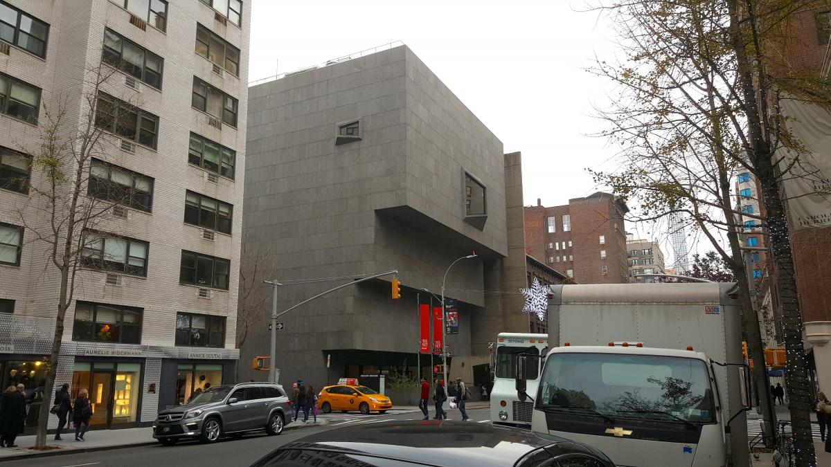
I was a kid but I remember when the Whitney Museum opened in a crazy modernist building designed by Marcel Breuer back in 1966. It was a big deal then and even fifty years later the building still looks modern, more so in fact than bunches of newer buildings. In any case the Whitney moved downtown and the Metropolitan Museum of Art took over the building to give more space for their modern art collection.
This past weekend I went to visit the new Met Breuer. I had wanted to see the exhibit by Diane Arbus - who I like and there was a major exhibition by Kerry James Marshall. I started at the top floor with an exhibit of Paul Klee.
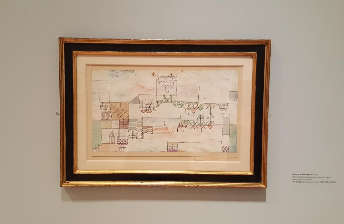
My eleven year old son said "These are just doddles". I was wondering "did I really dislike this stuff" or did I just had a closed mind and was being negative". I'm still not sure.
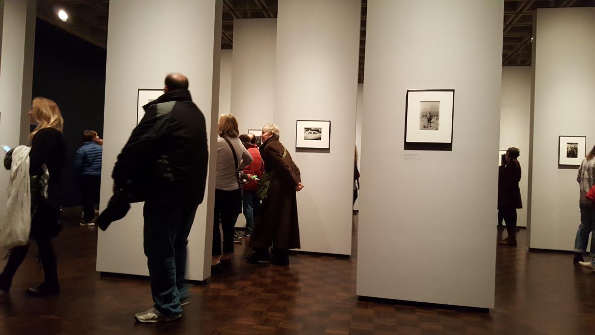
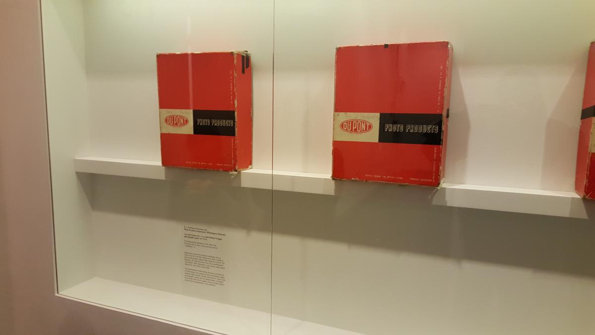
Then I went to the Diane Arbus show. It was early work, and like most creative people showed a glimmer of what she would become, but like most creative people, I cannot imagine her wanting this stuff to see the light of day anymore. Technically it wasn't very good, it was awkwardly displayed, poorly printed, and a lot of the shots were out of focus. In the context of modern ubiquitous cell phone photography lots of it seemed invasive without being informative. You really knew it was a show about having the material, not about what information and emotion the material was communicating when outside the restrooms the very storage cases the negatives were kept in were also on display.
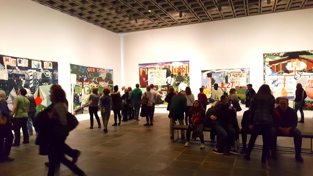
Finally two floor were given over to Kerry James Marshall, a major artist of our time. I didn't hate the stuff, his stuff is narrative which usually appeals to me but his overall lack or technique turned me off. Of the three exhibits his was the only one that I thought established a communication with the audience, but by the same token I think he could reach a larger audience if his technique was better. The questions I have for myself are: Would I have liked the work better if it wasn't in a crowded room? Would I have like it better if there were fewer pieces? Why am I missing the point?
What do I mean by this? To me great art, whether it is a play, a piece of furniture, a painting, a book, a movie, or a dance performance is about communication. Shakespeare's plays are 400 years old but they still communicate ideas and people still marvel at their ideas. Federalist furniture is two centuries old but it still tells us a story of proportion, restraint, and upper middle class but not regal luxury.
Older art by definition is pretty much filtered by time. Most of the crap doesn't survive and museum warehouses are full of the crap that does. Except as historical curiosities it stays hidden from view. The problem I have with so much of modern art is that I see it unfiltered by time. It's in a museum because some curator said it should be. The sad part is that the public, those wonderful folks who support the arts with grants, tax credits, and visits, aren't such fans as the curators would like them to be. If the art doesn't communicate with an audience, and the public stays away then our great institutions will find it harder and harder to get funded. And increasingly museums are places not for the citizens, but for tourists to cross off the map. Oh - I was asked by a staffer where we came from and on questioning I found that most of the visitors that day (and I think every day - even though it was a Sunday) are tourists, not locals. Not from around here. I can guess why.
Note: When you visit the Met - any branch, their policy is "pay what you wish" as long as you give them something you can get an admission pass. Kids under 12 are free. They have a large suggested donation but I pay based on how much time I plan to stay there and how flush I am feeling at the moment. The important point and I applaud the museum for this is that they would rather you and your friends and relations come visit and pay what you can, than be scared off by the not inconsequential suggestion of a $25 donation a head.
Note: I have been reliably informed that the Museum of Modern Art is getting rid of their once awesome design galleries and instead are spreading their design collections though other shows. I am not sure if this is to increase the overall quality of some of their other shows, or because they want to get people like me to rush through all their galleries in search of practical objects (I do need the exercise) but I pray that I am wrong and the design exhibitions will continue. Did you know that MOMA once, a long time ago, had practical classes in woodworking, pottery, and jewelry? I feel another blog entry coming on.
|
 Joel's Blog
 Built-It Blog
 Video Roundup
 Classes & Events
 Work Magazine


Oh and when I worked at Lehman Bros in 1981 we had a Nevelson in the reception area.
At least the horrid Soviet brutalist architecture rarely surrendered function to form, but that gawdawful thing does just that, while retaining all the charm of a outer oblast bureau building.